

Compare then contrast
creativesamba.substack.com
Compare then contrast

Death metal bands have a weird thing for spiky logos.
It looks like the spikier and the most-difficult-to-decipher the logo, the better.
There are thousands of death metal bands out there with spiky and exceptionally unreadable logos.
For example, see this poster from 2005 for Bay Area Death Fest 2 and you'll understand what I mean.
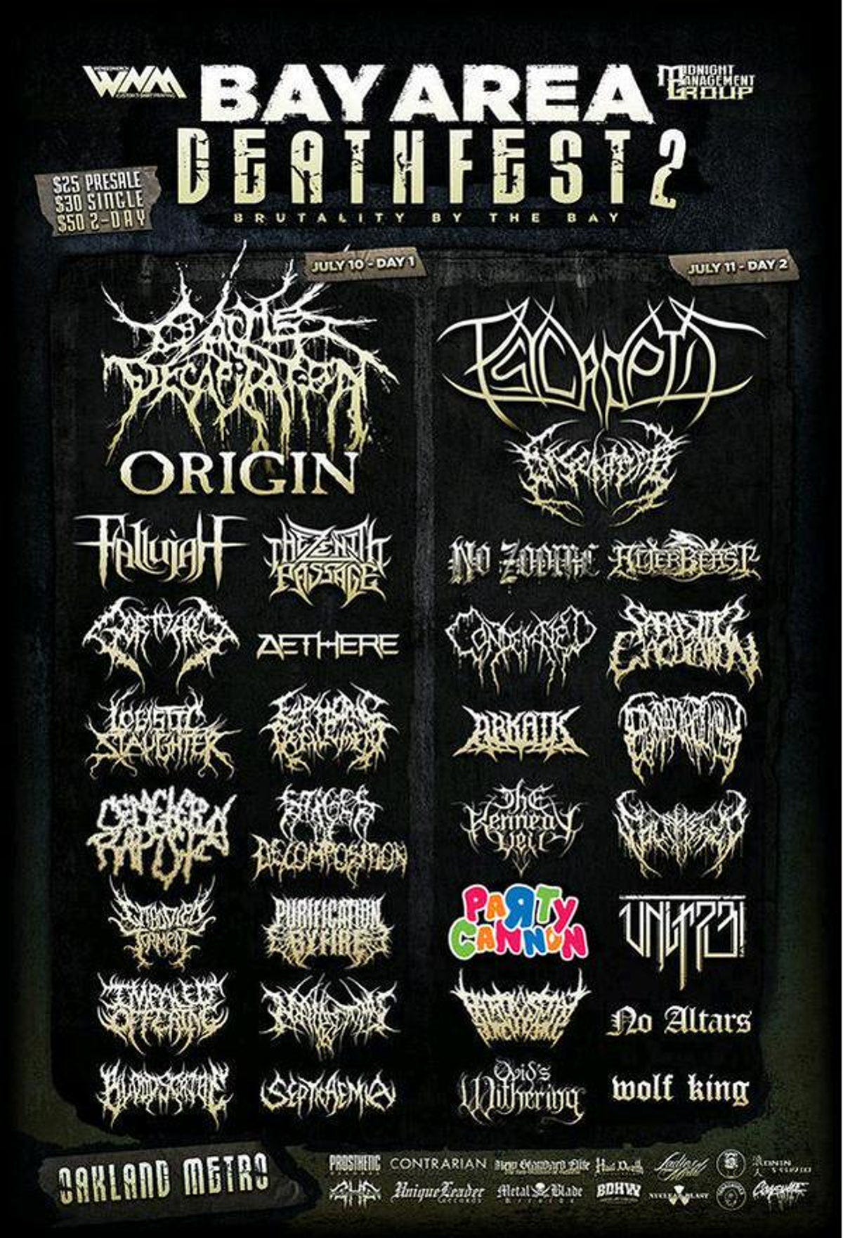
Among all the chaoti…
Keep reading with a 7-day free trial
Subscribe to Creative Samba to keep reading this post and get 7 days of free access to the full post archives.